Saturday, August 29, 2015
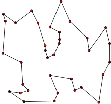
data optimization: Traveling 48 States
one year family trip in RV, while working remotely:
48StatesProject.com MAP

48StatesProject.com MAP
"...travel through all of the lower 48 states in one year's time"
by Jonathan “J.” Tower
podcast interview: Yet Another Podcast – Show 140: J. Tower | Jesse Liberty
The Definitive Road Trip? It's Data-Driven : NPR
"Randy Olson, a Ph.D. candidate at Michigan State University and a self-proclaimed "data tinkerer," believes he's devised a route that could allow a family to hit a landmark in each of the Lower 48 states...
Travelling salesman problem - Wikipedia, the free encyclopedia
"The travelling salesman problem (TSP) asks the following question: Given a list of cities and the distances between each pair of cities, what is the shortest possible route that visits each city exactly once and returns to the origin city? It is an NP-hard problem in combinatorial optimization, important in operations research and theoretical computer science."

visualization: The Age of Homes
Following is an interesting visualization map, but it could be misleading
because of using random color to represent ranges of values...
Big data needs smart visualization techniques... but what is a good way?
The Age of Homes in All 50 States | Zillow Blog
"...single-family houses built from 1900 to 2014 to see which decades are most represented by the current housing stock..."

I.e., what is a good way to color-code ranges of values on a chart or a map?
 ... mapping scalar values to colors... allows us to view scalar fields by coloring surfaces and volumes. ... rainbow color map... which naively sweeps through the most saturated colors, is well known for its ability to obscure data, introduce artifacts, and confuse users.
 bad vs. good


because of using random color to represent ranges of values...
Big data needs smart visualization techniques... but what is a good way?
The Age of Homes in All 50 States | Zillow Blog
"...single-family houses built from 1900 to 2014 to see which decades are most represented by the current housing stock..."
I.e., what is a good way to color-code ranges of values on a chart or a map?
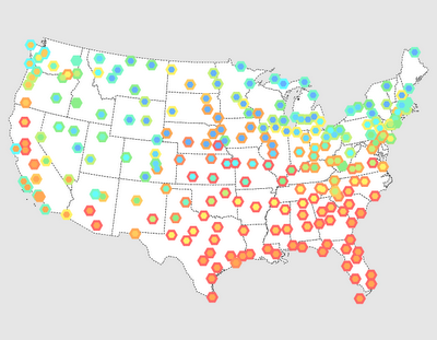
Based on this observation, next visual map is still not optimal,
while better than just using random colors as on the first map.
while better than just using random colors as on the first map.

elections are a typical example of using color-maps.
In that case two main colors are easy choice,
but different population density creates another challenge:
colored surface not proportional to number of values.
A better way is to utilize "bubble map"
Here is one example from Microsoft "Power Map" reporting tool.
Better, but still not perfect.
In all, color map visualization challenge appears to be not solved still.
If there is a good solution, it is hiding well from Google :)
Subscribe to:
Posts (Atom)