because of using random color to represent ranges of values...
Big data needs smart visualization techniques... but what is a good way?
The Age of Homes in All 50 States | Zillow Blog
"...single-family houses built from 1900 to 2014 to see which decades are most represented by the current housing stock..."

I.e., what is a good way to color-code ranges of values on a chart or a map?

 bad vs. good
Based on this observation, next visual map is still not optimal,
while better than just using random colors as on the first map.
while better than just using random colors as on the first map.
elections are a typical example of using color-maps.
In that case two main colors are easy choice,
but different population density creates another challenge:
colored surface not proportional to number of values.

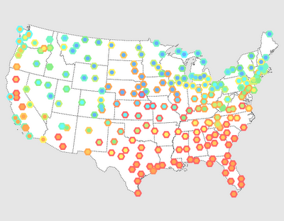
A better way is to utilize "bubble map"
Here is one example from Microsoft "Power Map" reporting tool.
Better, but still not perfect.

In all, color map visualization challenge appears to be not solved still.
If there is a good solution, it is hiding well from Google :)
No comments:
Post a Comment